Email Signature Layout: How to Structure a Professional Signature That Works
Learn how to design the perfect email signature layout with the right structure, spacing, and elements for every email client.
Email Signature Layout: How to Structure a Professional Signature That Works
Your email signature is more than a sign-off — it's a mini business card that appears at the bottom of every message you send. A well-structured email signature layout makes it easy for recipients to find your contact details, recognise your brand, and take action.
But get the layout wrong and your signature can look cluttered, break across email clients, or end up as an unreadable mess on mobile.
In this guide, we'll break down the key elements of a professional email signature layout, show you the most popular layout styles, and explain how to pick the right one for your role.
What Makes a Good Email Signature Layout?
A strong email signature layout balances three things:
- Clarity — your name, role, and contact details are easy to scan
- Hierarchy — the most important information stands out first
- Compatibility — the layout renders correctly in Gmail, Outlook, Apple Mail, and on mobile
The best layouts use HTML tables (not divs or flexbox) because email clients have limited CSS support. Keeping your signature under 600px wide ensures it displays properly on all screen sizes.
Essential Elements of an Email Signature Layout
Before choosing a layout style, decide which elements to include. Here's what most professionals use:
Must-Have Elements
- Full name — your first and last name, prominently displayed
- Job title — your role or position
- Company name — where you work
- Phone number — a clickable
tel:link for mobile users - Email address — a clickable
mailto:link
Optional Elements
- Company logo — reinforces brand recognition
- Profile photo or headshot — adds a personal touch
- Website URL — drives traffic to your site
- Physical address — essential for businesses with a location (link it to Google Maps)
- Social media icons — LinkedIn, Twitter, Instagram, etc.
- QR code — lets people save your contact details instantly
- Promotional banner — highlight a sale, event, or CTA
The key is not to include everything. Pick the elements that matter for your role and industry, then arrange them in a clean layout.
The 5 Most Popular Email Signature Layouts
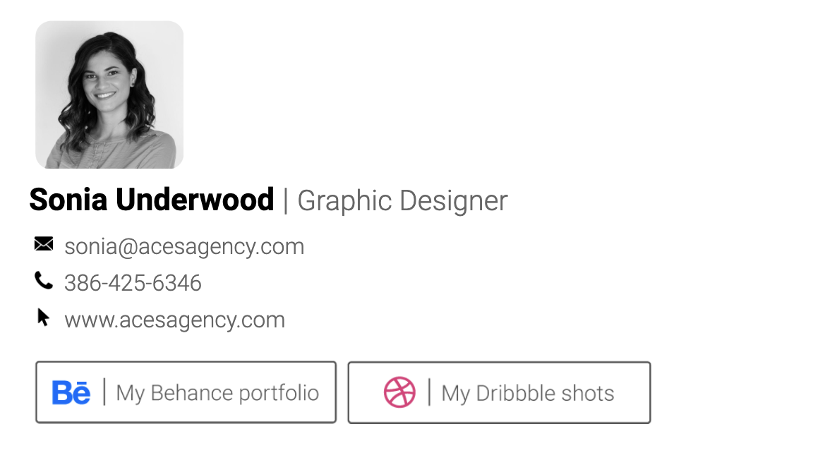
1. Sidebar Layout (Two-Column)
The sidebar layout places your logo or photo on the left, with text details on the right, separated by a vertical line or colour accent.
Best for: Corporate professionals, consultants, agencies
Structure:
- Left column: logo or headshot (80–120px wide)
- Right column: name, title, company, contact details, social icons
This is the most widely used layout because it's compact, professional, and works well across all email clients. The two-column structure keeps everything organised without taking up too much vertical space.
2. Stacked Layout (Vertical)
Everything is stacked top to bottom — name, title, contact details, then social links. No columns, no side-by-side elements.
Best for: Minimalists, freelancers, mobile-first users
Structure:
- Name and title at the top
- Contact details listed vertically
- Social icons at the bottom
The stacked layout is the most mobile-friendly option since it doesn't rely on columns that might collapse. It's also the simplest to build and maintain.
3. Centered Layout
All elements are center-aligned, often with a circular headshot at the top. This creates a modern, card-like appearance.
Best for: Creatives, designers, personal brands
Structure:
- Centered headshot or logo
- Name and title centered below
- Contact details centered
- Social icons in a row
This layout works well for people who want their signature to feel more like a personal brand card than a corporate sign-off.
4. Banner Layout
A compact signature with a full-width promotional banner at the bottom. The banner can link to a landing page, event, or special offer.
Best for: Marketing teams, sales professionals, event promotion
Structure:
- Standard sidebar or stacked layout on top
- Full-width clickable banner image below
The banner layout turns every email into a marketing opportunity. Just make sure the banner has a clear call to action and isn't too tall (60–80px works well).
5. Grid / Card Layout
A modern layout that arranges elements in a grid pattern, often with background colours or card-like sections.
Best for: Tech companies, startups, creative agencies
Structure:
- Header section with name and title (often with a background colour)
- Body section with contact details in a grid
- Footer with social links or branding
Grid layouts feel contemporary and distinctive, but they require more careful HTML coding to render consistently across email clients.
Email Signature Layout Best Practices
Keep It Compact
Your signature should be no taller than 150px for a standard layout. If you include a banner, keep the total under 200px. Oversized signatures annoy recipients and get clipped by email clients.
Use a Maximum Width of 600px
Most email clients display content at 600px wide. Designing within this constraint ensures your layout doesn't overflow or cause horizontal scrolling.
Stick to Web-Safe Fonts
Email clients don't support custom fonts. Use web-safe options like:
- Arial
- Helvetica
- Georgia
- Verdana
- Courier New
Don't Use Background Images
Many email clients (especially Outlook) strip background images. Use solid background colours instead, or keep your background white.
Make Everything Clickable
- Phone numbers should use
tel:links - Email addresses should use
mailto:links - Your website should link to the full URL
- Social icons should link to your profiles
- Your address should link to Google Maps
Optimise for Mobile
Over 60% of emails are opened on mobile. Test your signature layout on both desktop and mobile to make sure:
- Text is readable without zooming
- Links and icons are tappable (minimum 44px touch target)
- The layout doesn't break on narrow screens
Use Proper Image Sizing
- Logo: 80–120px wide
- Headshot: 80–100px, square or circular
- Social icons: 20–24px
- QR code: 80–120px
- Banner: full width, 60–80px tall
Always set explicit width and height attributes on images and host them on a CDN (not as attachments) to prevent them from appearing as downloads.
Common Email Signature Layout Mistakes
Too Many Elements
Including every possible detail — multiple phone numbers, five social platforms, a disclaimer, a quote, and a banner — creates visual noise. Stick to what's essential.
Using Divs Instead of Tables
HTML email rendering is stuck in the early 2000s. Use <table> elements for layout structure. Divs with CSS positioning will break in Outlook and many other clients.
Inconsistent Sizing Across a Team
If your team members each have different signature layouts, it looks unprofessional. Use a signature management tool to enforce a consistent layout across the company.
Forgetting the Separator
A horizontal line or colour divider between your email body and your signature helps readers distinguish your message from your sign-off. Most professional layouts include a subtle border or spacing.
Not Testing Across Clients
A layout that looks perfect in Gmail might break in Outlook. Always test your signature in at least three email clients before rolling it out.
How to Choose the Right Layout for Your Role
| Role | Recommended Layout | Why |
|---|---|---|
| Corporate / Finance | Sidebar | Professional, compact, universal |
| Creative / Designer | Centered or Grid | Modern, distinctive, brand-forward |
| Sales / Marketing | Banner | Every email becomes a campaign |
| Freelancer | Stacked | Simple, mobile-friendly, personal |
| Legal / Medical | Sidebar | Formal, credential-focused, compliant |
| Tech / Startup | Grid or Stacked | Clean, modern, minimal |
Create Your Email Signature Layout in Minutes
Designing an email signature layout from scratch requires HTML knowledge and hours of cross-client testing. Or you can use SendSignatures to create a professional, tested layout in under 2 minutes.
With 41 templates to choose from — including sidebar, stacked, centered, banner, and grid layouts — you can pick a design that matches your brand, fill in your details, and copy it straight into Gmail, Outlook, or Apple Mail.
Features include:
- QR code contact cards
- Google Maps address links
- Clickable social media icons
- Promotional banners
- CDN-hosted images (no attachments)
- Mobile-optimised layouts tested across all major email clients
Create your signature now — it's free to start.
Create your professional signature now
It takes less than 2 minutes. Works perfectly in Outlook, Gmail, and all email clients.
Get Started Free